Branding
EXPLANATION
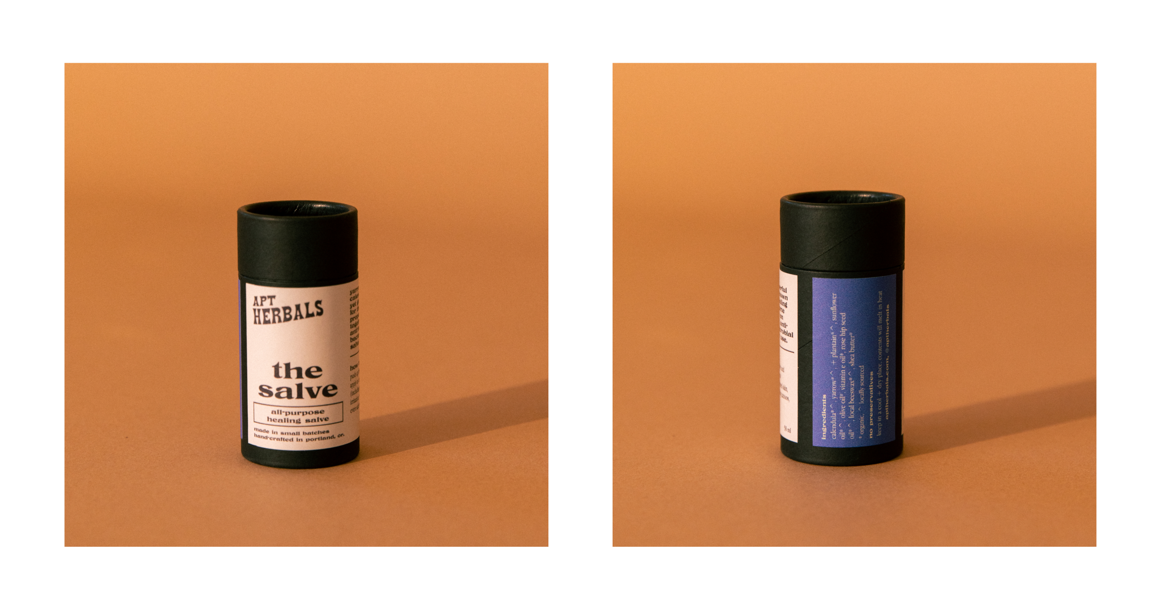
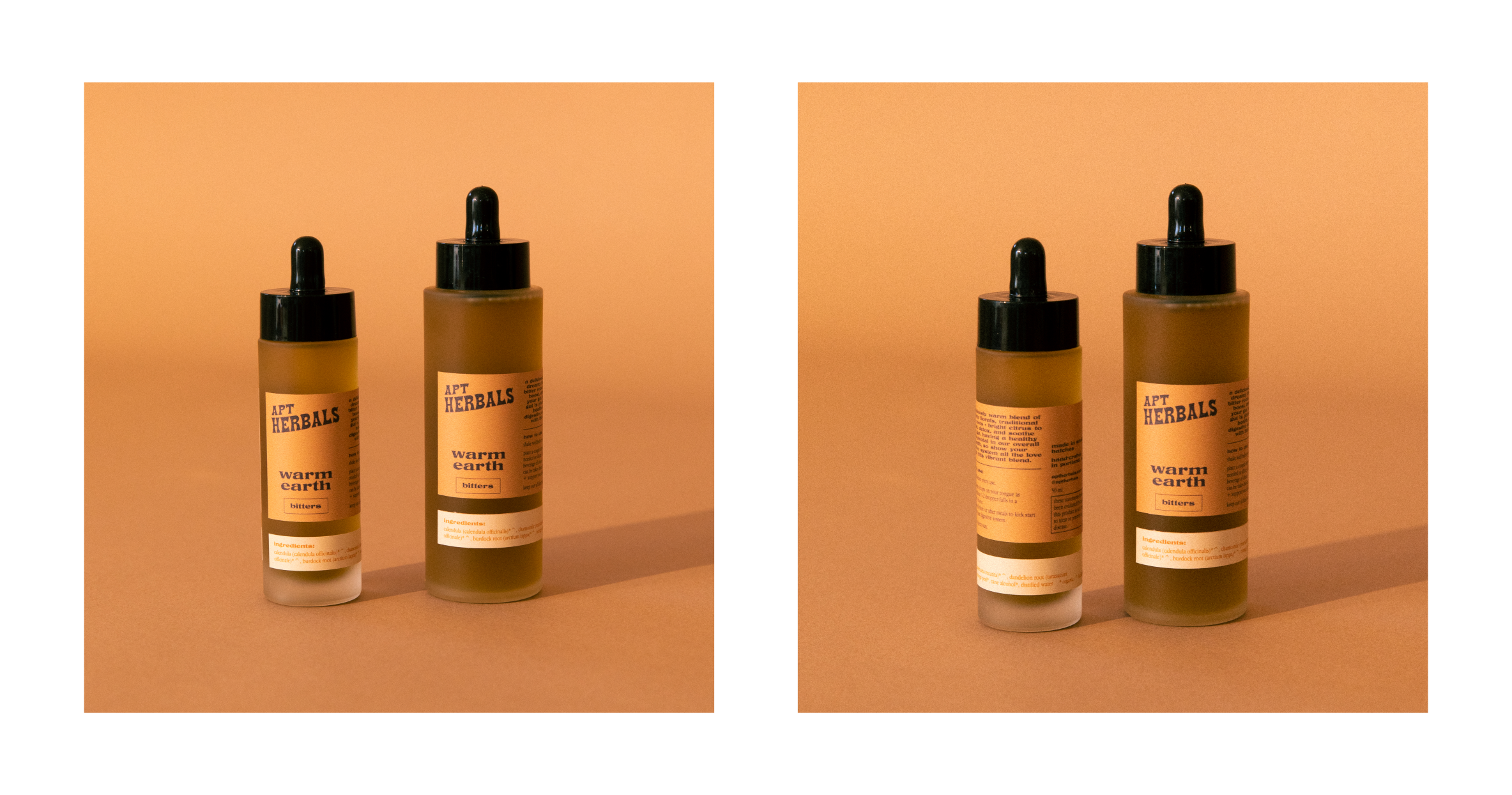
The branding for APT Herbals was one of my favorite projects to date. The type was chosen to evoke a sense of elegance, simplicity, and nurturing. The type face guidance was an easy to follow one which allowed for rapid product expansion while maintaining a streamlined, simple look. The color palette lends well to both fun social media assets and photography to more subtle earthy tones used in packaging. The product line derived from handmade essential oils and extracts, many of which come from Samantha (Owner’s) garden.


